
Between 2014 and 2022, roughly 40% of all interior paint sold in the United States was some shade of gray. Agreeable Gray, Repose Gray, Dorian Gray, Mindful Gray, Passive, Colonnade, Revere Pewter.
Not one gray. Dozens, all slightly different, all promising the same thing.
That promise quietly broke somewhere around 2023, and the regret wave is now hitting millions of homeowners who painted every room the same cool neutral and woke up one morning feeling like they lived inside a cloud. I have watched this cycle play out across three decades of interior trends, and the correction happening right now is unlike anything since the beige-to-gray flip of 2012.
But the replacement color most people are reaching for is already a mistake, and the reason involves what happened to your eyes after eight years of gray.
Would you like to save this?
How Gray Conquered Every Room in America
Paint manufacturers saw it coming before homeowners did.
In 2013, Sherwin-Williams reported that gray had overtaken beige as the top-selling neutral family for the first time in the company’s history.
By 2016, the top five best-selling interior colors at both Sherwin-Williams and Benjamin Moore were all grays. Agreeable Gray alone moved enough volume to become the single most popular paint color in North America for six consecutive years.
The mechanism was not taste. It was consensus.
Real estate agents started recommending gray for staging because it photographed well under listing lights. Builders switched to gray because it paired with the white-quartz-and-brushed-nickel palette that was dominating new construction. Pinterest and Instagram amplified the signal, turning gray interiors into the visual shorthand for “modern” and “clean.”
YOU’LL ALSO LOVE25 Things About Your Home That Visitors Notice in the First 10 Seconds (But Never Tell You)
Homeowners who had no particular opinion about gray painted their walls gray anyway, because everything they saw online said gray was the safe choice. Builder-grade gray became so standard in new construction that buyers walking into a 2018 spec home could not tell whether the walls were intentionally chosen or simply the default. In most cases, they were the default.
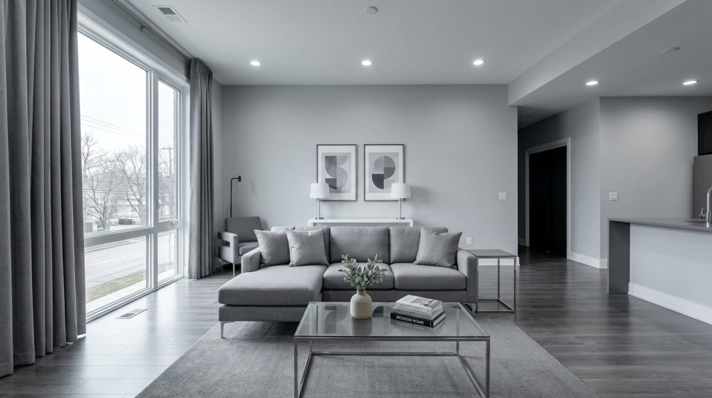
And for a while, it was fine. Gray sold houses. Gray photographed well. Gray matched everything. The problem is that “matches everything” and “makes you feel something” are two different promises, and gray only ever delivered on the first one.
Nobody hated gray on move-in day. The hate comes later, slowly, in the form of a creeping restlessness you cannot quite name. It is the feeling of living in a room that does not reflect anything about you, because it was chosen to reflect nothing at all.
Your Eyes Adjusted and Then Rebelled
Here is the part nobody talks about. Human color perception is adaptive. Your brain recalibrates to the dominant color in your environment within roughly 72 hours of continuous exposure.
That means after three days in a gray room, your visual cortex stops registering gray as a color at all. It becomes the baseline. Everything else in the room reads relative to it.
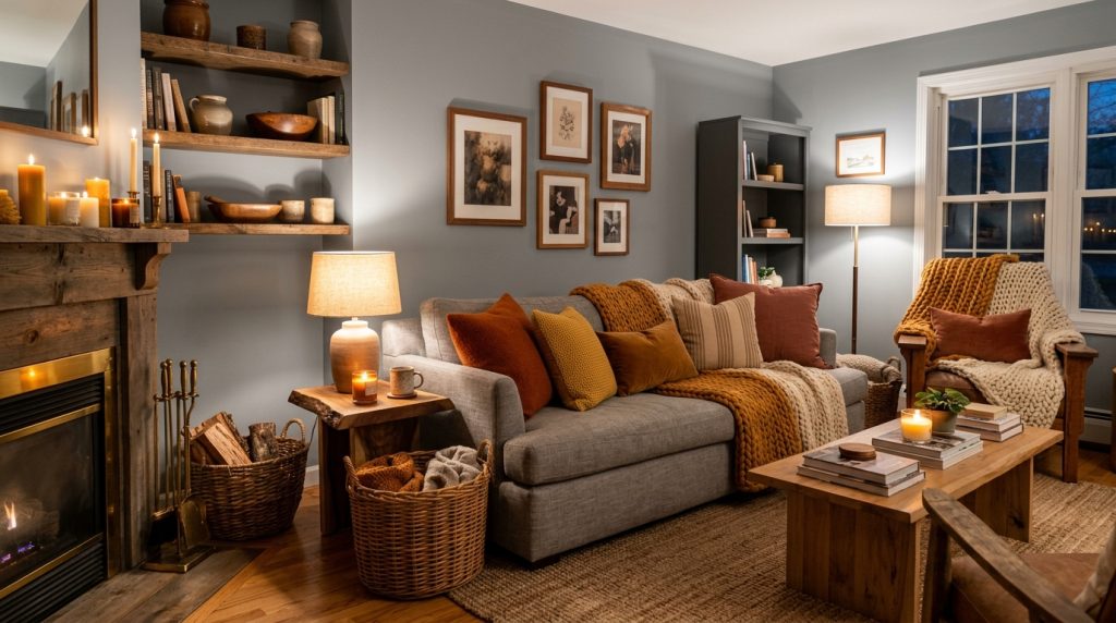
The consequence takes about two to three years to become conscious. You start adding warmer throw pillows. Then a warmer rug. Then candles, wood tones, woven textures, anything with warmth.
You are not redecorating. You are compensating. Your nervous system is starving for chromatic warmth that the gray walls refuse to provide, and it sends you shopping for accessories that fight the room instead of working with it.
One homeowner I spoke with described it perfectly: she spent $3,200 on warm-toned accessories over eighteen months trying to make her Repose Gray living room feel alive, then realized the $400 repaint was the actual fix.
Neutral Fatigue Runs on a Clock
Paint psychologists at the Color Association of the United States have a term for this. They call it “neutral fatigue,” and they track it on a seven-to-ten-year cycle.
Beige fatigue peaked in 2012. Gray fatigue peaked in 2023. The timeline is almost mechanical.
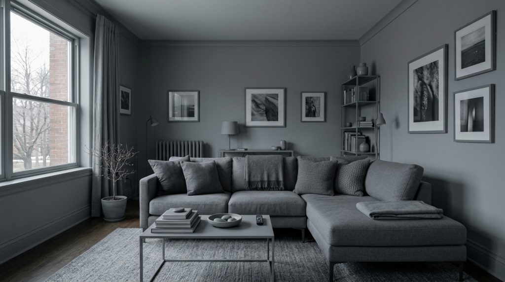
Repose Gray and Agreeable Gray Are Not Aging Well
Not all grays are fading equally. The cool-toned grays with blue or purple undertones are aging the worst. Under LED lighting, which has become the dominant residential light source since 2018, these cool grays shift even cooler.
A wall that looked sophisticated under incandescent bulbs at the paint store now reads almost lavender under the 4000K LEDs in a kitchen ceiling fixture. Homeowners are not imagining the color shift. The light literally changed.
YOU’LL ALSO LOVE30 Things in the 1970s Living Room That Would Confuse Anyone Under 30
Agreeable Gray has held up slightly better because it carries a warm undertone that buffers the LED shift. But even Agreeable Gray is showing its age in homes where it was used on every surface.
The issue is monotony, not the color itself. When the same color runs from the entryway through the kitchen through the hallway through the bedrooms, the house stops having spatial identity. Every room blurs into the next. Architects call this “tonal flattening,” and it makes a 2,400-square-foot house feel like a 1,200-square-foot apartment.
Take a guess. How many homeowners painted more than three rooms in the same gray between 2015 and 2021? Industry surveys put the number at roughly 60%. That is millions of homes, all experiencing the same creeping dissatisfaction right now.
Warm Whites Are Winning, but Most People Pick Wrong
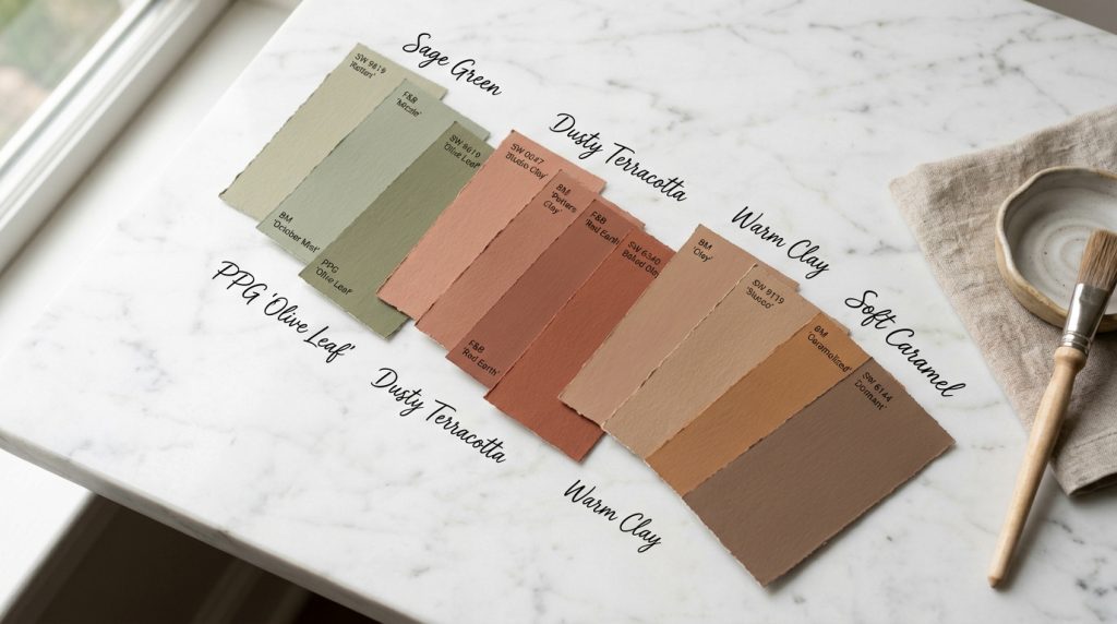
The correction is already underway. Benjamin Moore’s 2024 and 2025 color reports show warm whites and earthy neutrals outselling cool grays for the first time since 2013.
The frontrunners are not new colors. They are old ones that fell out of fashion during the gray era:
- Swiss Coffee: OC-45, warm cream base
- White Dove: OC-17, soft and versatile
- Simply White: OC-117, clean but not cold
- Alabaster: SW 7008, warm undertone with depth
These are warm-based whites that read as “bright but not cold,” which is exactly the antidote to eight years of gray.
But here is where the correction goes wrong. Most homeowners leaving gray are picking their replacement color the same way they picked gray, by looking at what everyone else is choosing. They grab the trending warm white and roll it on every wall, and within three years they will be sitting in the same monochromatic trap.
The specific warm white matters less than how you use it. Painting every room the same warm white is not an upgrade from painting every room the same gray. It is the same mistake in a warmer temperature.
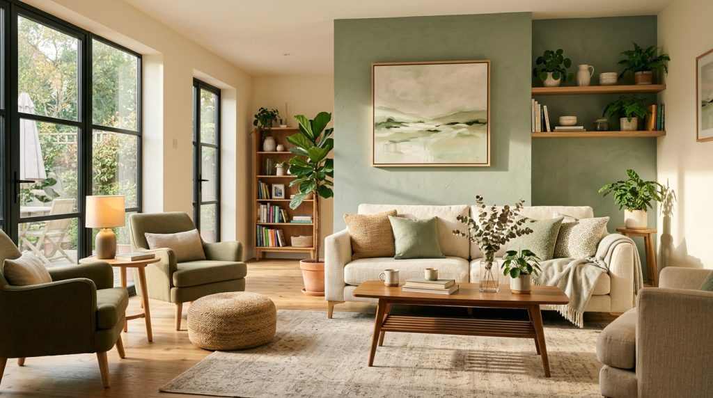
Designers who understand the cycle are recommending a two-tone approach. One warm white for the main living areas, and a second color with actual hue, a muted green, a dusty terracotta, a soft blue, for the rooms that need personality. That second color is the one gray never allowed, and it is what your house has been missing.
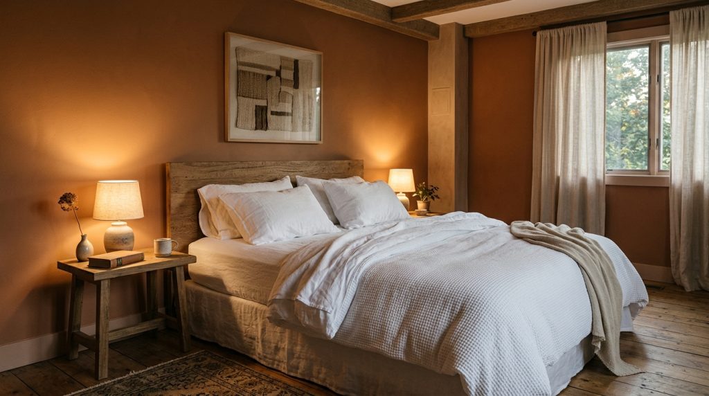
Gray Bedrooms Are Where the Regret Hits Hardest
Living rooms and kitchens get all the attention in the gray conversation, but the room where gray does the most psychological damage is the bedroom. Color therapists have documented that cool gray walls in a sleeping environment suppress melatonin-friendly warm tones and create what they describe as an “emotional flatline” in the space where your body is supposed to feel safest.
You spend roughly a third of your life in your bedroom. If those walls are Passive or Lazy Gray, your brain is spending eight hours a night recalibrating to a color temperature that reads as overcast sky. That is not restful. It is numbing.
The correction in bedrooms is moving faster than anywhere else in the house. Warm whites are the safe swap, but the more interesting move is what designers call “bedroom-specific color,” a color chosen entirely for how it reads at 10 PM under a bedside lamp.
YOU’LL ALSO LOVE11 Neighborhood Rules Every Kid Knew in the ’80s That No Parent Would Allow Today
Muted terracotta and warm clay tones are replacing gray in primary bedrooms across the South and Midwest faster than any other room category, according to paint retailer data from 2024 and 2025. The reason is simple: warm earth tones make skin look healthier under lamp light, and people want to feel good in the room where they end and start every day. A $300 repaint in a warm clay can change the emotional temperature of a bedroom in ways that a $3,000 furniture swap cannot.
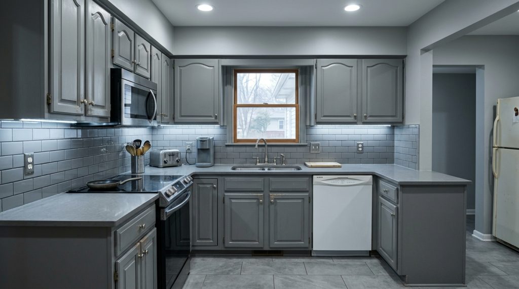
Gray Kitchens Are Losing Resale Value
Real estate data is starting to confirm what homeowners are feeling. A 2024 analysis by Zillow’s paint color study found that homes with warm-toned kitchens sold for an average of $1,800 more than homes with cool gray kitchens in comparable markets.
The premium is small in absolute terms, but the directional shift is significant. For the first time in a decade, gray is not the safe staging choice. It is the dated one.
Would you like to save this?
Kitchen gray is aging faster than living room gray because kitchens have more fixed surfaces. Gray cabinets, gray tile backsplash, gray quartz countertops, and gray walls combine into what designers now call “the gray box,” a kitchen where every surface is the same temperature and the room feels like a walk-in cooler.
The backsplash tile and the countertop cannot be repainted. They require a full renovation to replace, running $8,000 to $15,000 depending on the kitchen’s size and the materials involved.
That is the real cost of gray regret: the walls are a weekend fix, but the fixed surfaces are a five-figure problem.
Homeowners who installed gray subway tile in 2017 are now staring at a backsplash that signals “seven years ago” the same way yellow oak cabinets signaled “1994” in the early 2010s. The cycle is predictable. The cost of being inside it is not.
Paint Companies Already Know What Comes After Warm White
If you want to know where residential color is heading, skip the influencer accounts and look at the commercial paint company forecasts. Sherwin-Williams, Benjamin Moore, and PPG all released their 2026 and 2027 trend reports within the last year, and the convergence is unusual.
All three are pointing toward what the industry is calling “chromatic neutrals,” neutrals with visible hue that do not read as bold.
Think sage greens, dusty terracottas, warm clay tones, washed denim blues, and soft caramels. These are colors with enough personality to register as an intentional choice, but enough restraint to function as a backdrop.
The specific frontrunner for 2027 is a muted green in the sage-to-eucalyptus range. It pairs with wood tones, works under both LED and natural light, and carries enough warmth to avoid the cold-room problem that killed gray.
The lesson from the gray era is not that gray was a bad color. It is that consensus is a bad designer. Any color chosen because everyone else chose it will age the same way gray is aging now.
YOU’LL ALSO LOVE25 ‘Common Sense’ Home Rules Everyone Followed in the 80s That Would Get You Laughed At Today
The homeowners who will avoid the next regret cycle are the ones who pick colors based on how their specific rooms feel at 7 PM under their specific light, not based on what trended on a screen.
A room that faces north gets different light than a room that faces south. A room you use at 7 AM needs a different color temperature than a room you use at 9 PM. A living room where you entertain needs a different energy than a bedroom where you decompress. Gray treated every room the same way, and the replacement color should not make that mistake again.
Social Media Drove Gray In, and Social Media Is Driving It Out
The same algorithm that convinced 40% of American homeowners to paint gray is now showing them warm interiors and making them feel behind. Pinterest trend data from late 2024 shows that searches for “warm living room” and “cozy earth tone rooms” have increased by 340% over three years, while searches for “gray living room ideas” have dropped 58% in the same period.
This is not organic taste evolution. It is the same consensus machine running in reverse. The difference this time is speed. The beige era lasted roughly twenty years (1990 to 2012). The gray era lasted eight (2014 to 2023). Social media compresses trend cycles because it makes everyone aware of what everyone else is choosing at the same time.
The next consensus color will have an even shorter lifespan, likely five to six years. Which means the homeowners who pick the trending warm white right now and roll it on every wall are already halfway through the clock before they finish the second coat.
The only defense against the cycle is intentional, room-specific color choices made under your own lights, in your own house, at the time of day you actually use each room. That is the opposite of what social media encourages, and it is the only approach that survives the consensus machine.
How to Test Whether Your Gray Still Works
Before you repaint everything, try this. Buy a single quart of the warm white you are considering and paint a 3-foot-by-3-foot square on your most-used gray wall. Live with it for five days.
Look at it in morning light, afternoon light, and under your evening lamps.
If the warm white makes the gray around it look sick, cold, or purple by comparison, your gray has aged out and the repaint will feel like removing a filter from your entire house. If the gray still holds its own next to the warm white, your issue might not be the color itself but the monotony.
In that case, the fix is adding one room of intentional color rather than repainting everything. A single room in a muted sage or warm clay, even just the room you spend the most evening time in, can break the gray monotony without triggering a whole-house project.
Average cost for repainting one room yourself: $150 to $300 in paint and supplies. Average cost of hiring it out: $400 to $700. Either way, it is a fraction of the $3,200 in compensating accessories.
Have YOU started regretting your gray walls yet? We want to hear about it in the comments.